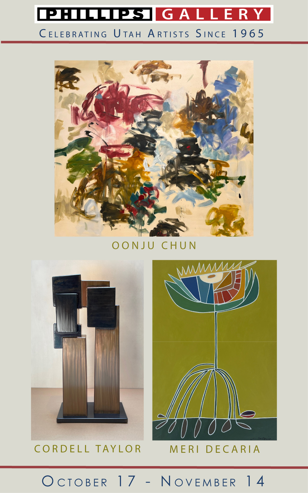
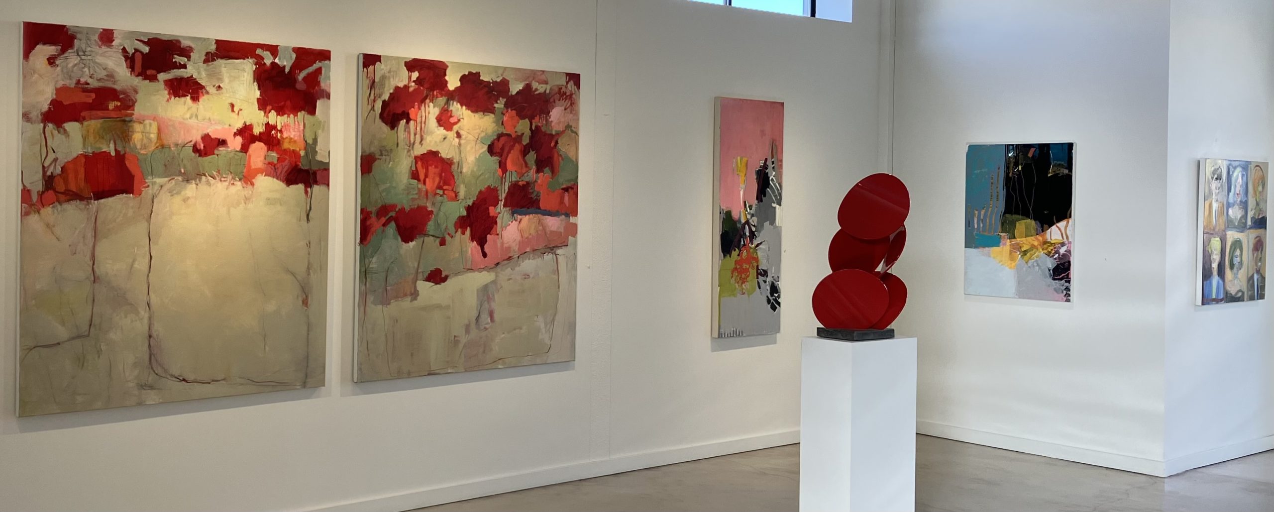
Installation view at Julie Nester Gallery’s Autumn Show. Image by Geoff Wichert.
The folks at Julie Nester Gallery in Park City have a healthy appetite for abstraction, but they tend to make sure it’s about something. The poster child for their Autumn Show, Newport Beach painter Chris Gwaltney’s “Carnival Ride (book reading chairs),” not only includes the title pair of chairs, which display a whole carnival of paint splashes, drips, layers, marks, and other delights to enjoy, but tells a story about how something that is flat can acquire depth, even as it points up the connection that underlies the difference between a carnival seat and a reading chair: “How is a book like a roller coaster?” it riddles. Presumably, the answer lies in the reader’s imagination.
Nearby are three canvases by Fort Lauderdale’s Madeline Denaro, which while they do not contain conventional representations, nevertheless present paint in ways that seem like real behaviors. In “Remnants of Tomorrow,” for example, the white filigree in the upper left-hand corner weaves a kind of lattice that could easily be some kind of a free-standing element. At top center, the same could be said of the loops hung together on lines that circle around the purple dome that emerges from a darker structure. These figures are negatives drawn from their backgrounds, as if their paint bodies had been cut out from it. Another identical, or close to identical element near the bottom of the figure reveals the texture of rose color that, once observed, can be seen to show through a variety of forms missing from nearby. A light green shape to the right looks like a sphere that seems to protrude from another part of the rose background. Here, it would seem that Denaro is working neither from memory nor imagination, but as though she were actually thinking (and playing) in the medium of painted gestures and shapes, forging a rational, logical argument from premises made of pure color.
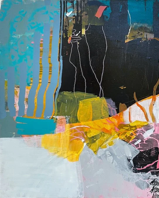
Madeline Denaro, “The Chapter Continues,” synthetic polymer on canvas, 40 x 30 in.
In “Pinky Swear” and “The Chapter Continues,” Denaro as much as confirms the rhetorical and linguistic nature of her paint handling. In “Pinky Swear,” the way an elaborate structure has been laid down, then almost covered in places by the mask of pink(y) paint calls to mind how a preliminary statement of standing fact can serve as a support for a later argument, occasionally popping through the subsequent ideas to remind listeners that they are still there: still in effect. The same thing happens, for instance, to the aqua-on-blue-green zone in “The Chapter Continues,” while the delicate pink tracery on the right suspends parts below against the effect of logical gravity.
One of the more engaging ways of giving content to abstraction is seen in Bay Area painter Marshall Crossman’s “Class Photo Series #164,” which takes the audience back to high school and beyond, with a nod to the hard-working yeoman photographers whose thousands of portraits must somehow find their way to countless indifferently judgmental customers. We can imagine the effort these former would-be artists must make to please picky parents and subjects with no regard for the lensmen’s own artistic aspirations. What Crossman achieves is to convey the character and egotistical self-projections of what are essentially blobs of paint lacking any real features. It could even be argued that the longer the viewer looks at them, the more these smears seem to reveal frozen grimaces, in precisely the way that so many photos do. Crossman endows both her aspiring colleagues and their subjects with more interior presence than a crate of the real products ever could.
Julie Nester Gallery’s sequence of three connected spaces allows artists who have completed their designated appearances not only to remain on the premises, but to continue showing in new assortments of their previous presentations. So Jennifer Nehrbass, whose Albuquerque backgrounds suit Nester’s Park City location, has adapted her desert landscapes over the years to accommodate her desire to introduce women into the Western scene and story. (https://artistsofutah.org/15Bytes/index.php/the-forgotten-frontier-jennifer-nehrbass-paints-women-into-the-west/). This may be one of the epitomes of using abstraction to carry a point. The mythopoetic look of the West, like that of the large buildings and iron bridges of the East, can convey either a generic look or specific details to fit the need.
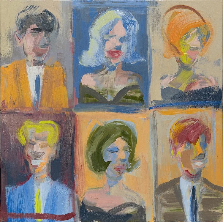
Marshall Crossman, “Class Photo Series #164,” oil on canvas, 36 x 36 in.

Erik Gonzales, “Let Forever Be,” mixed media on canvas; 48 x 44 in.
What seems to be a really intriguing variation on some recent trends appears in Erik Gonzales’ “Let Forever Be.” It resembles a recent, popular form of mixed media, but given an apparently original twist involving the artist’s own illusionistic conception. In the original, a pre-existing plan, such as a blueprint or a two-dimensional pattern, is superimposed by collage onto an object that, in theory, was made according to its own quite different plan. In “Let Forever Be,” a set of white shapes that look like patterns, complete with evocative lines that imply some information about their meanings, are laid out upon a pre-existing black, blue, gold, and white pattern of brush work. One possibility might be that a pattern that eludes understanding is being superimposed on a field of natural chaos, which might bed a creditable explanation for how the real world works.
The thirteen paintings by nine stalwart artists all convey some arguable level of representation. Not so the three enamel-coated, geometric steel sculptures. Many, though not all of the sculptures shown here are figurative, doing original things with human forms in various sizes and poses. Other sculptures, like the ones actually here, are geometric in form. It would be interesting to know why these three are so much in contrast with the painted works they accompany. One thing for sure is that where many venues allow their artists to make such choices, there’s usually a sense of past, future, and deliberate purpose in Julie Nester’s choices.
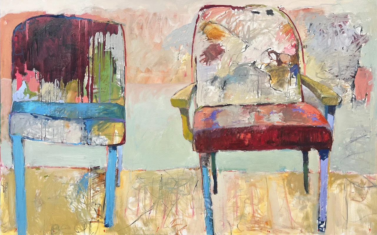
Chris Gwaltney, “Carnival Ride (book, reading chairs),” oil on linen, 65 x 102 in.
Autumn Show, Julie Nester Gallery, Park City, through December 2.
Geoff Wichert objects to the term critic. He would rather be thought of as a advocate on behalf of those he writes about.
Categories: Exhibition Reviews | Visual Arts