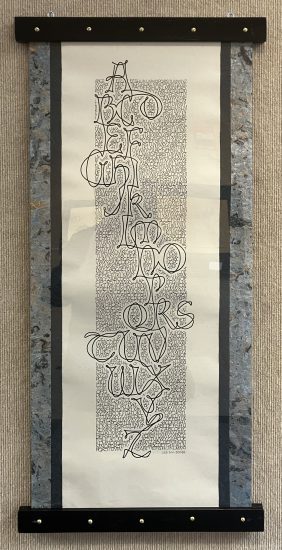
Jane Hales curates a visual meditation on Shakespeare’s famous line, with each variation on “To be or not to be” revealing the range of expressive possibilities in calligraphy.
In reference to works of art, “calligraphy” is often used as an adjective. For example, we say a certain artist’s line quality is “calligraphic.” But of course fine hand-lettering is a visual art form in itself, one inclusive of language, but also able to function apart from it. That it’s most often used to spice up an otherwise plain text is not the calligrapher’s choice, any more than it’s a photographer’s preference to put your portrait on a driver’s license. It’s a rare opportunity when, as is happening now at the Utah Cultural Celebration Center, we have a chance to see local calligraphers strut their stuff by showing off some of the many unique ways these artists have invented to show off the graphic language in which they excel.
There are, of course, countless letter fonts that can be employed to write out a message. One of the huge advances made when computers became commonly available has to do with what’s called “kerning,” which refers to the space between letters. On a typewriter, that space is always the same, no matter whether it’s an I or a W. This looks clumsy at best. A computer uses different distances for the letters it employs. But an expert will explain that it’s not the distance between letters, but the space between them, which is ultimately determined by their shapes. A calligrapher starts there, but goes further. Subtle changes in the shape of a given letter are part of the skill as well.

Then there’s the matter of color. The drama of black versus blue may occupy most lives, and of course there’s always the personal choice that can be made by anyone bringing their own marker to the task. As will quickly become obvious at the UCCC, not only are there an infinite number of hues that can work in a written document, but they can be surrounded and augmented by use of the same or related ones. Sometimes an ornament is drawn using the same style of mark as the letters employ, so that a bird, for example, seems to emerge from the same family of shapes as the written word.
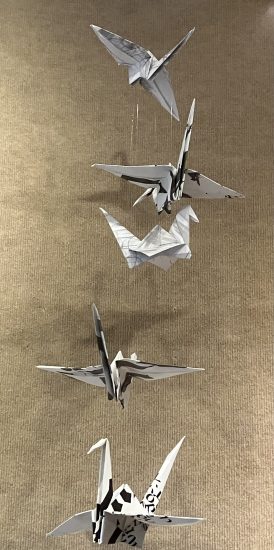
Then there is the question of what to write on. Many of the examples here include three-dimensional supports. One of the most exotic techniques is to write and perhaps draw on a piece of card stock, then fold it into an origami form like a crane or other shape. Origami, like calligraphy, has a universe of its own. One example is the folding of paper money into objects that foreground the printed data, such as placing Washington’s face as the gem on a folded finger ring, a great favorite of those who enjoy giving a café server a special tip. Ah, but that’s a topic for another day.
Artists are likely to have spent a good part of their education doodling on their notebook pages. One infinitely variable trick is to give the letters depth such as by drawing their shadows on the page, and while a calligrapher may do this, another approach is to letter on glass, then mount the result so the shadows become real.
One of the virtues of the UCCC’s display space is the large vitrine adjacent to the main gallery. Here are found examples of how a calligrapher might approach the design and execution of a project. It turns out that it’s rarely practical to just start writing. Sometimes dozens of models, mockups, and experiments precede the final version, even when that must still be done freehand. The remarkable thing about the exhibition is how surprisingly many forms and variations are possible once the computer is set aside and the practiced hand and eye take over.

Carole Taylor pairs calligraphy with a chalk-style portrait of Mark Twain, whose biting humor comes through in this quote skewering politics.
Learn to Fly, Utah Cultural Celebration Center, West Valley City, through October 15.
Geoff Wichert objects to the term critic. He would rather be thought of as a advocate on behalf of those he writes about.
Categories: Exhibition Reviews | Visual Arts
